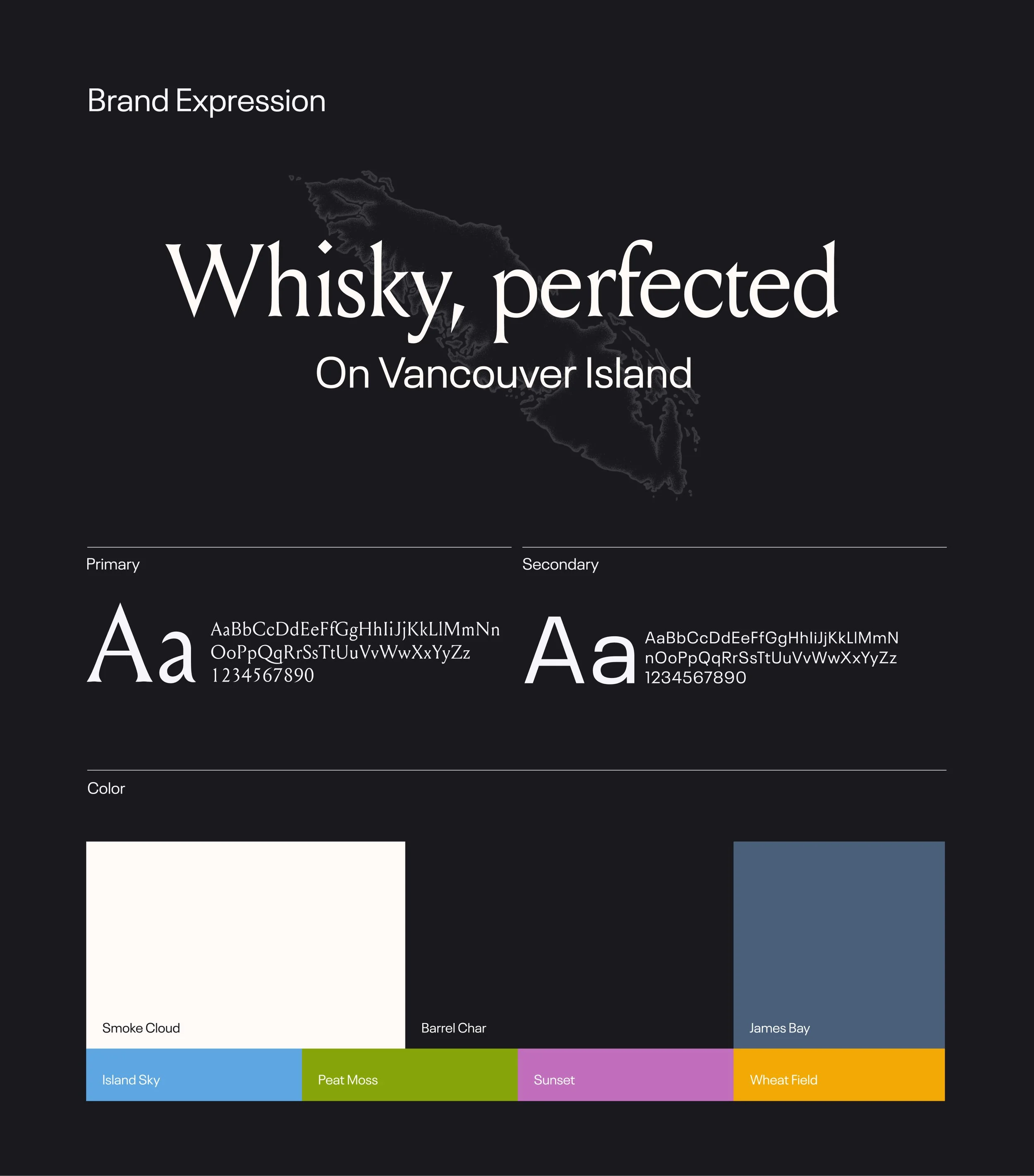
Macaloney’s is a Vancouver Island distillery built on craftsmanship, authenticity, and a deep connection to place. From smoking their own peat to meticulously refining every bottle, the brand embodies a distinctly Canadian work ethic and dedication to quality. The challenge was finding a way to stand out in an increasingly crowded whisky market while preserving its premium positioning.
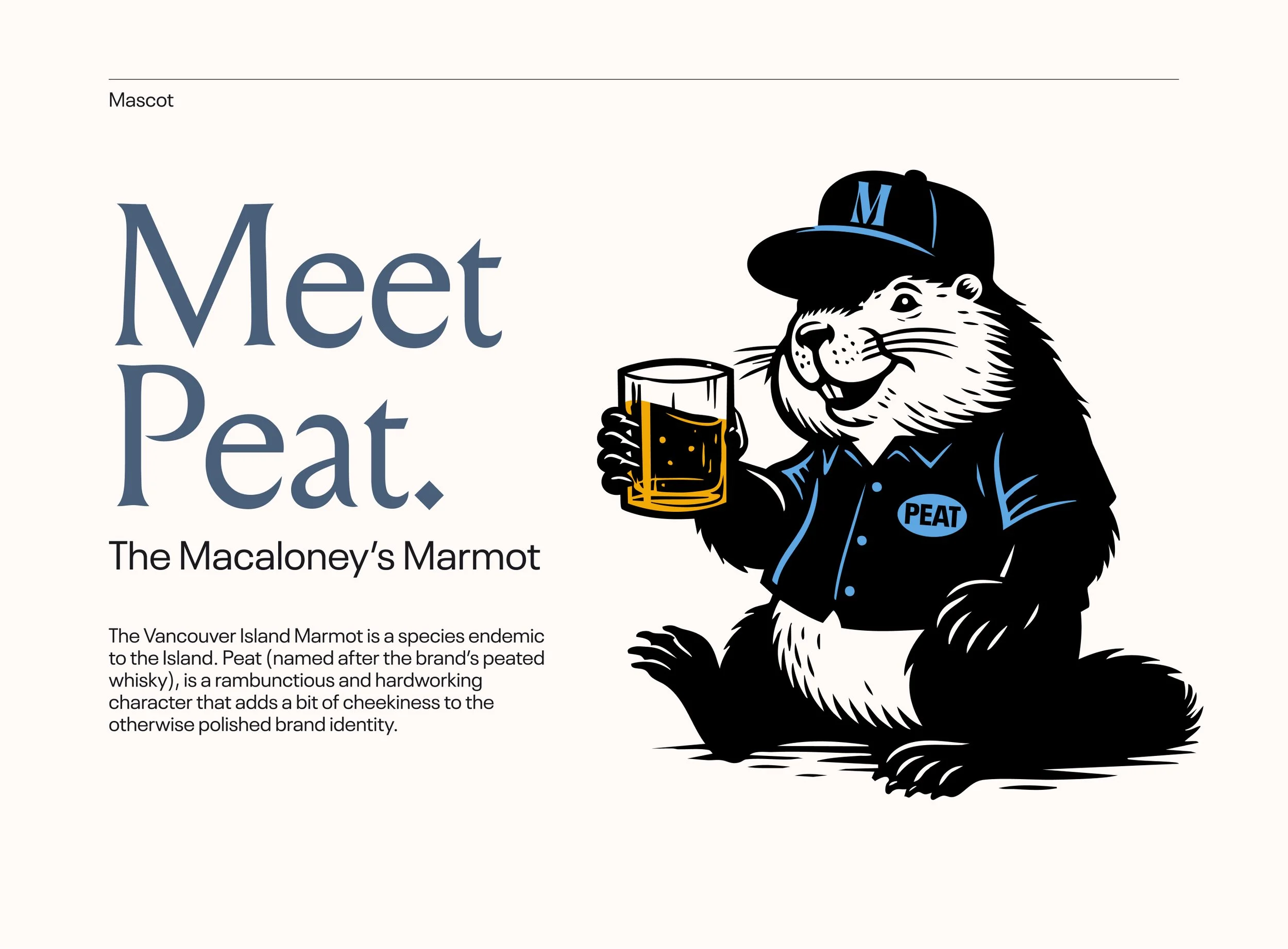
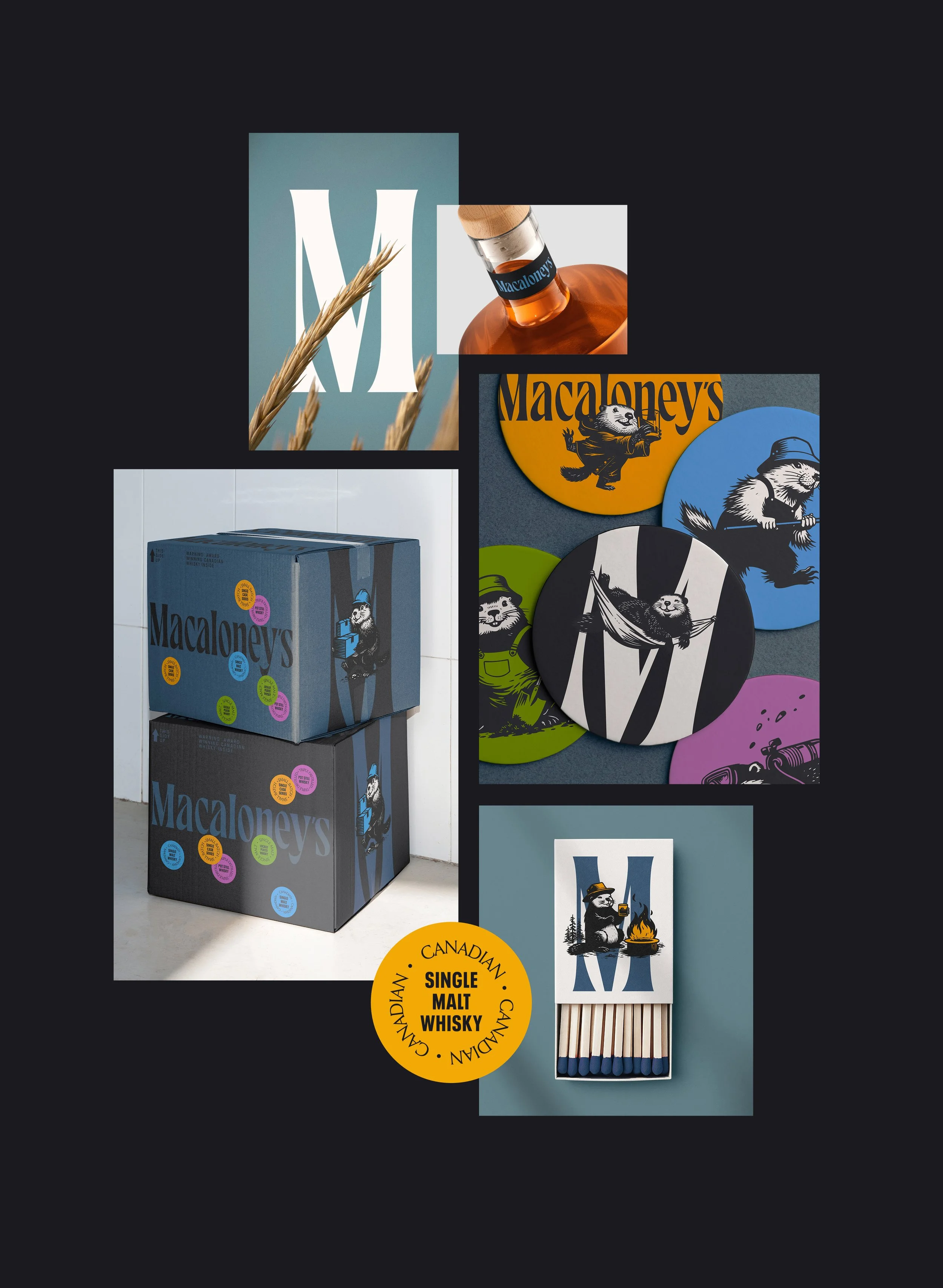
Our solution balanced sophistication with personality. We introduced Peat, a hardworking Vancouver Island marmot, a species found nowhere else in the world, as the brand’s mascot. Peat brings warmth, character, and a sense of storytelling to the identity, complementing the refined typography and premium photography with playful illustrations and vibrant accents. The result is a brand system that feels both elevated and approachable, celebrating the craftsmanship behind the whisky while giving consumers a memorable character to connect with.